The interior design of the BEAUTY CODE cosmetology clinic
The interior design of the BEAUTY CODE cosmetology clinic embodies the concept of cleanliness, light, and minimal detailing. At the same time, it looks classic and refined.
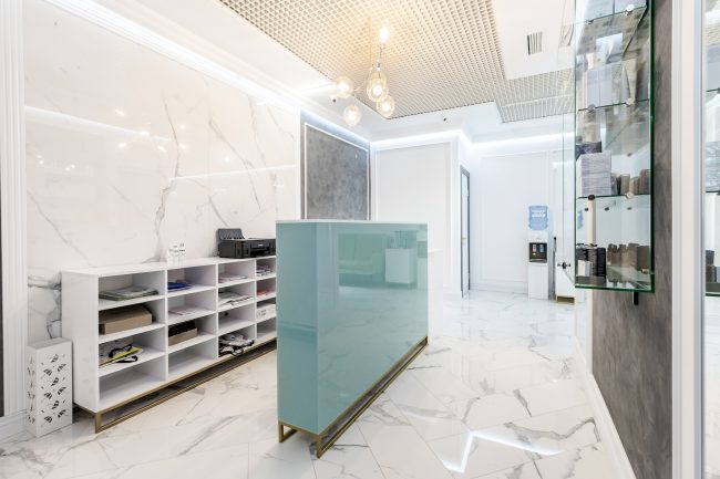
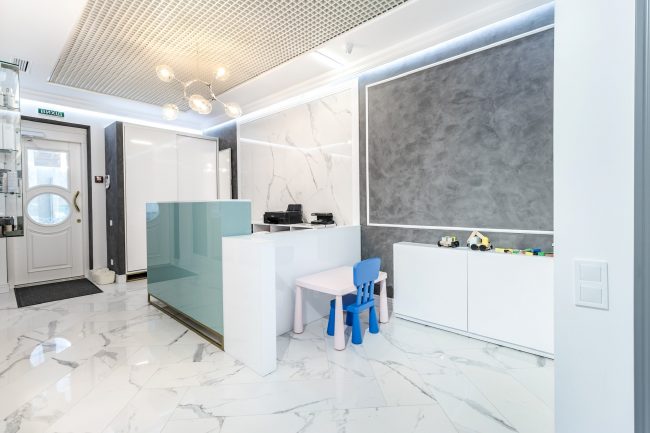
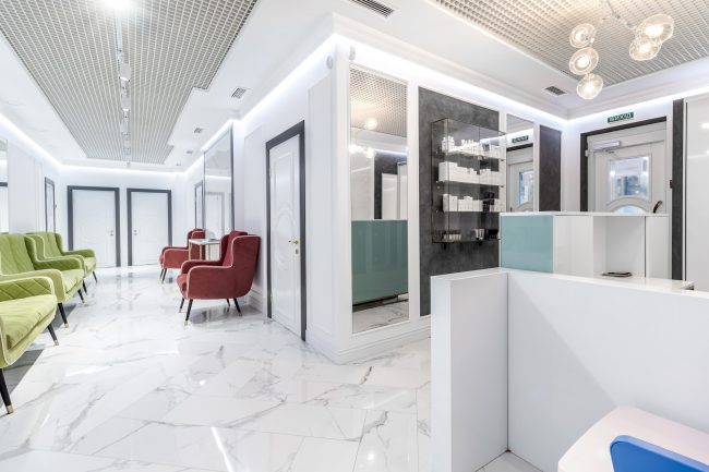
Upon entering, visitors see a reception desk in an unusual sea wave color, along with elegant sliding wardrobes for clothes and umbrellas. Snow-white and graphite colors are combined here in a harmonious union, eliminating monotony: the wardrobe walls with white fronts on a dark background are highlighted by white decorative lines.
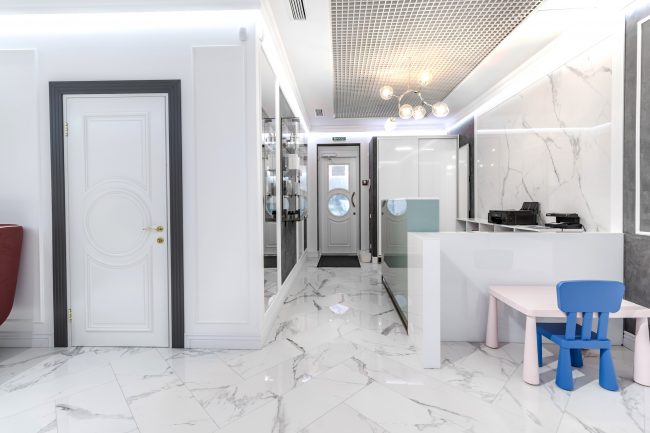
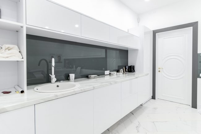
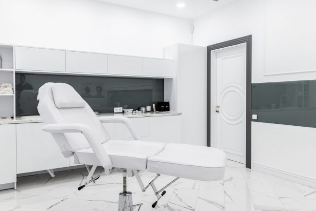
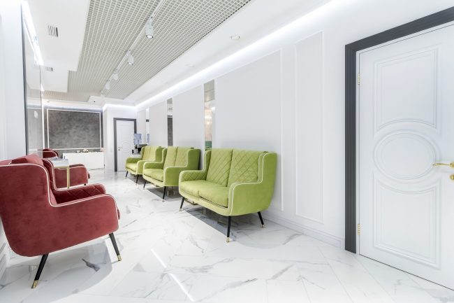
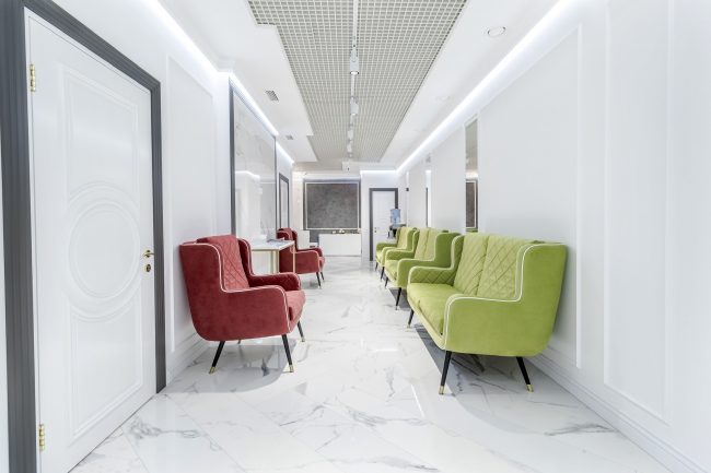
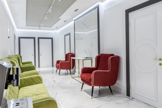
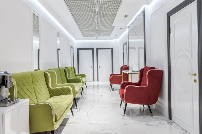
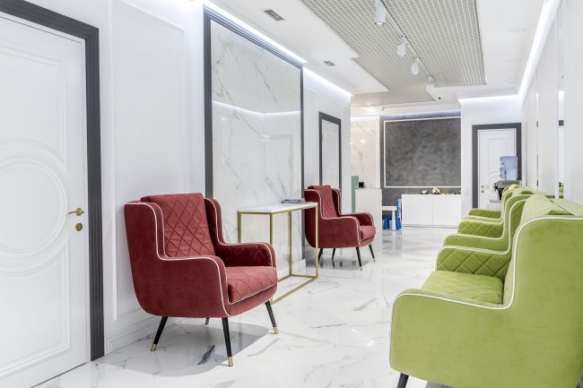
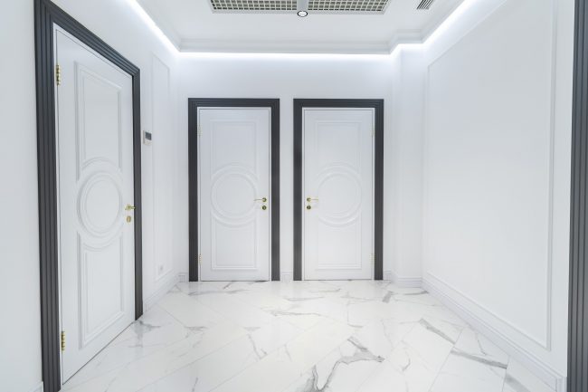
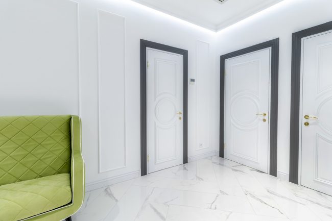
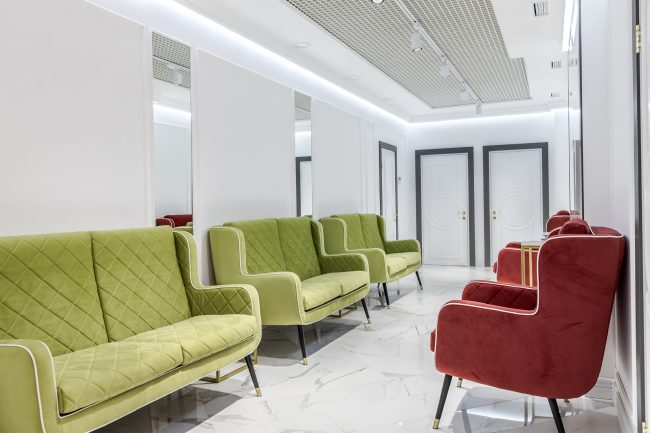
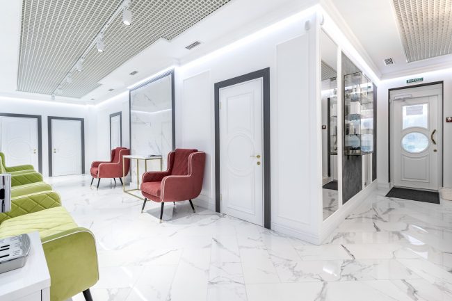
The design of the clinic’s corridors is as simple as possible — the floor is covered with white tiles resembling marble with Calacatta gray veins, and the white walls are decorated with overlaying convex slats — gypsum moldings that create rectangles. The central part of the ceiling is occupied by a grigliato grid, to which modern spotlights are attached. Rhythm is achieved here through gray moldings and door trims in the same color. All doors in the clinic are custom-made. They are in white, yet simple and elegant, as they are decorated in the center with a relief oval medallion.
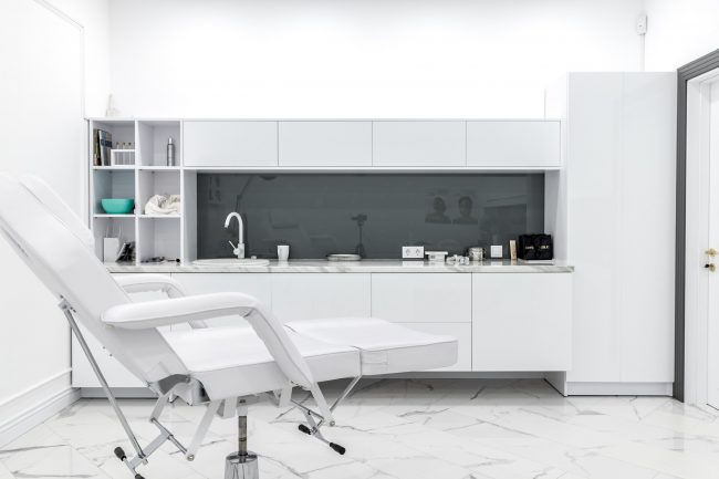
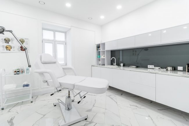
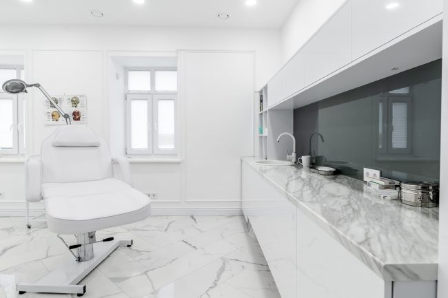
The furniture adds a special touch to this white interior with its simple shape and practicality, which is repeated in all rooms. They have glossy white fronts. However, some cabinets in the corridors are meant to draw the attention of clients, as they are intended for branded cosmetic products, and thus have the appearance of glass showcases. Soft chairs along the walls stand on thin legs, in the style of the 60s of the last century. They serve as a pleasant visual accent — thanks to the burgundy and pistachio shades of the upholstery.
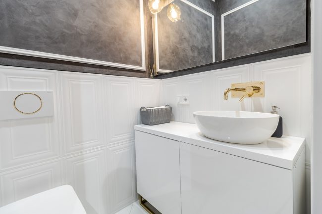
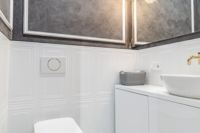
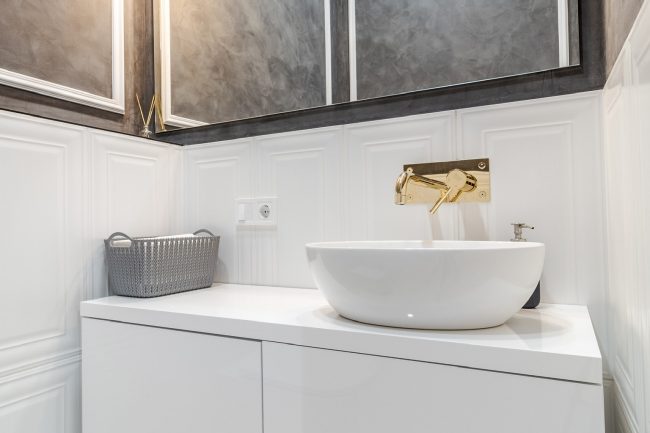
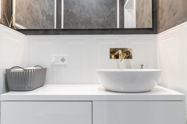
The design’s effectiveness is ensured by tall, ceiling-high mirrors. In the bathroom design, a subtle hint of luxury is provided by the lamps and a shiny, wall-mounted faucet — both united by the gleam of gold.
#Best_Interior #Interior_Design #Realisation
