The design of the dental clinic SYMBIOTYKA
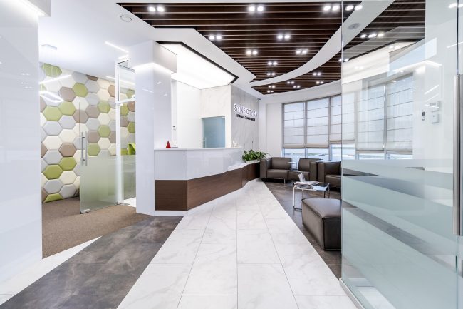
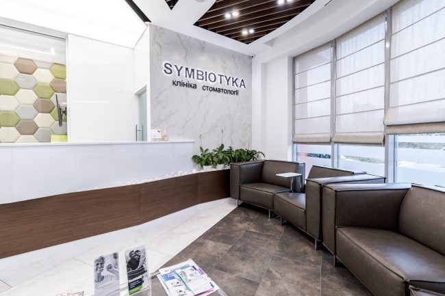
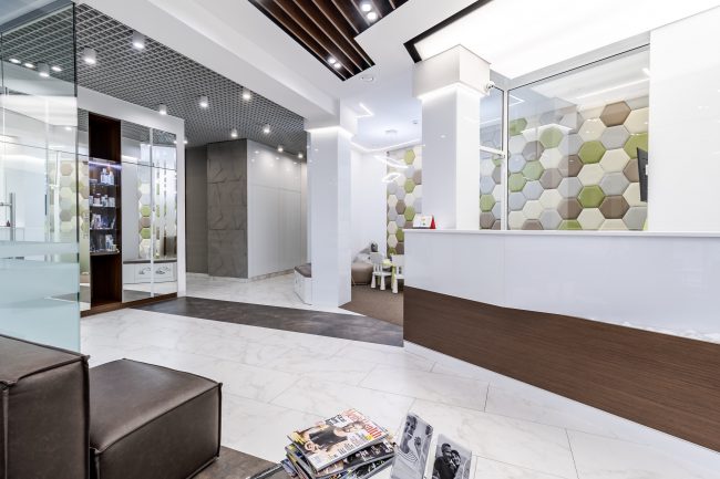
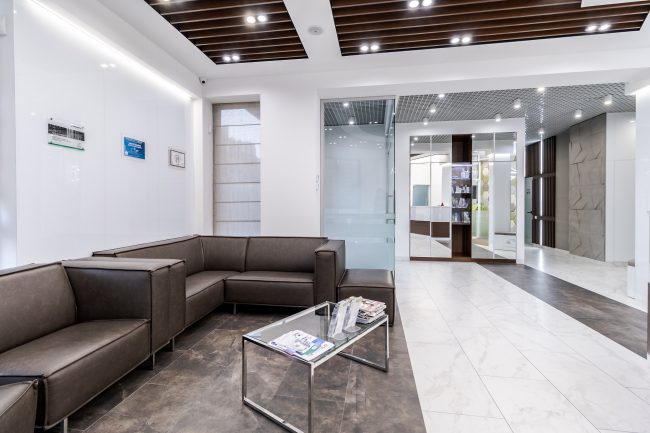
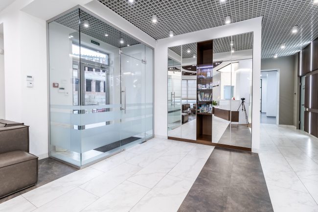
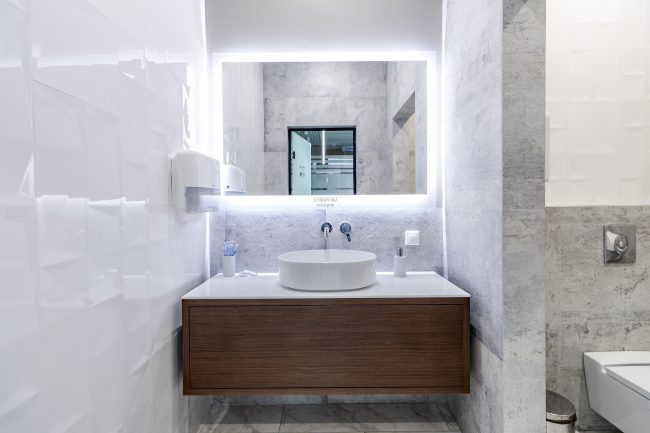
The design of the dental clinic is remarkably harmonious and modern. It employs a concept of color contrasts between white and dark brown, materials that imitate natural ones—marble, wood, and leather, clear geometric lines, and zoning of spaces.
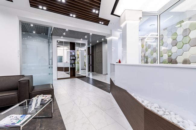
The entrance is designed as a box, with walls made of glass panels. The lobby design aims to create a comfortable area for visitors to wait for their appointments. To the left of the entrance is a wardrobe with mirrored doors. You can enter the lobby and reception by turning right.
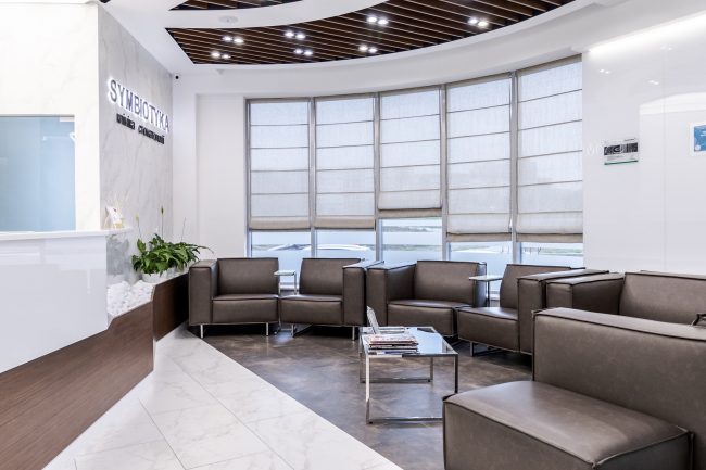
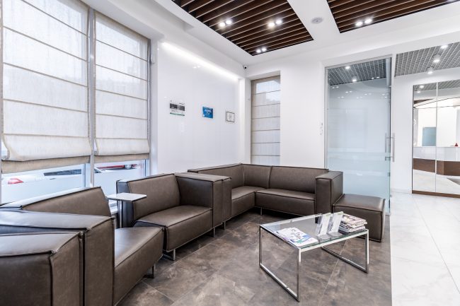
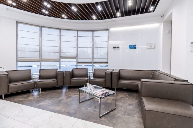
The reception area includes a large counter for several administrators, which is clearly separated from the waiting area by the flooring finished with tiles of different patterns and colors. Soft sofas and chairs are arranged in a large semicircle along the walls, matching the shade of the panel that imitates natural wood at the lower part of the administrators’ counter. Live plants contribute to stress reduction and a pleasant mindset.
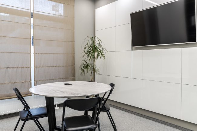
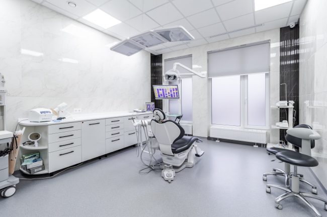
All window openings are adorned with Roman shades in a milky hue. The rooms are filled with light as we have placed many spotlights everywhere. They are hidden behind a grid on the ceiling, while rectangular lamps hang down on thin suspensions, and there is LED backlighting behind the panels.
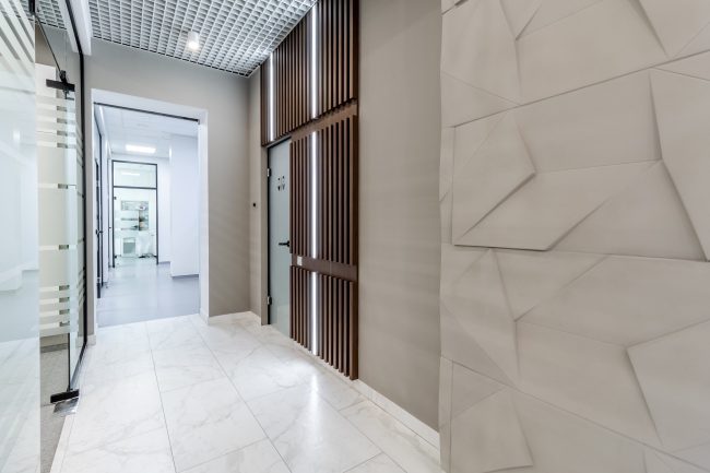
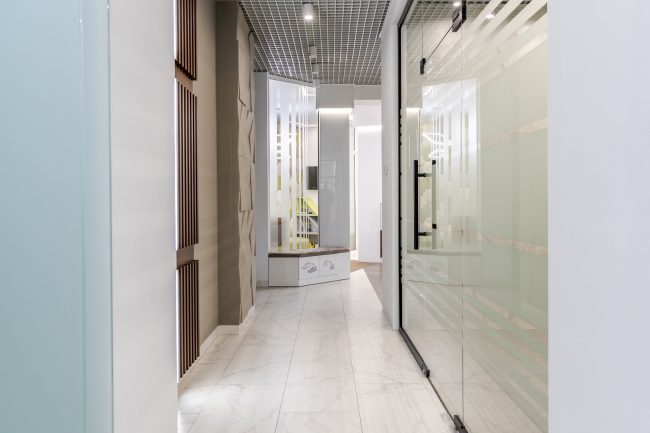
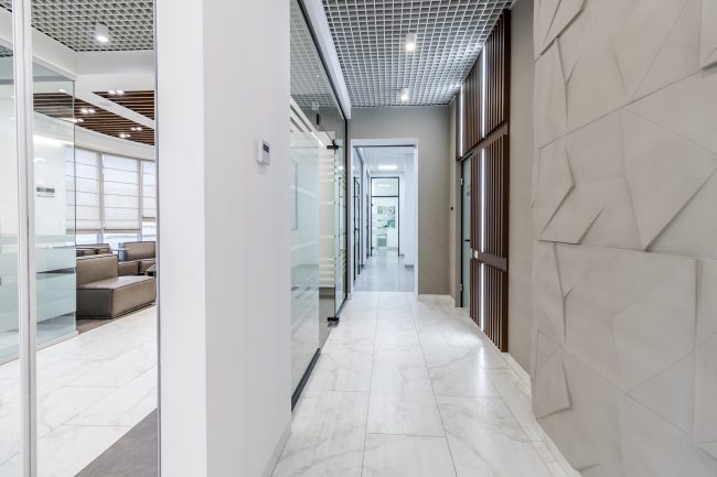
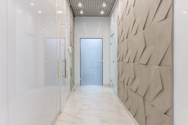
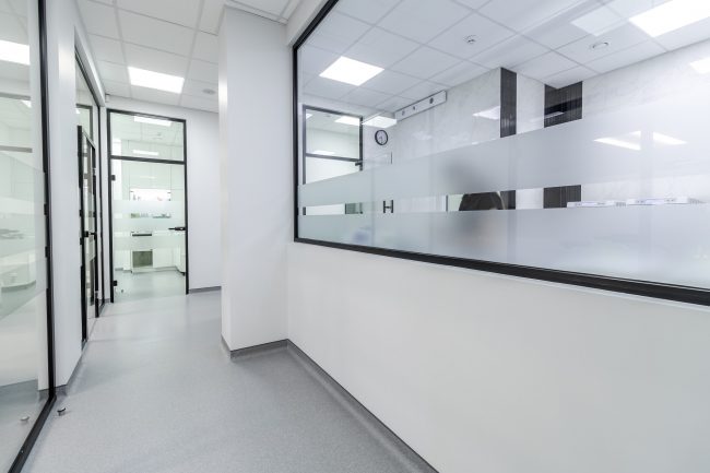
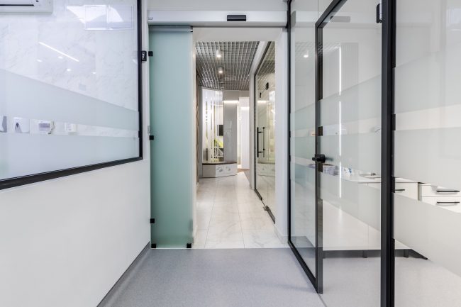
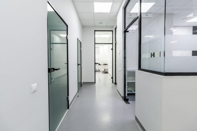
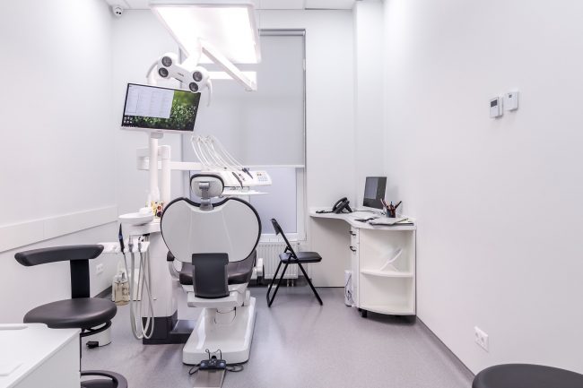
The ceiling design is uniform throughout the corridors—next to the grid, which conceals the lamps fixed against a dark background. In the offices, preference has been given to the use of white square ceiling panels.
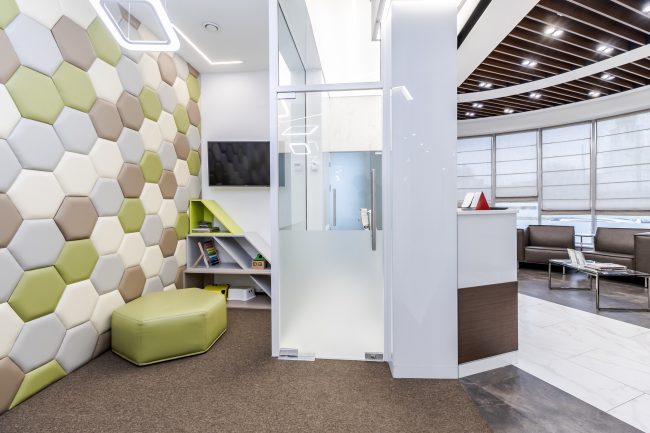
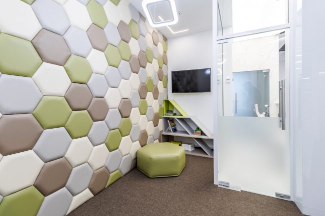
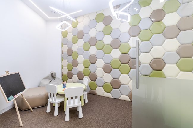
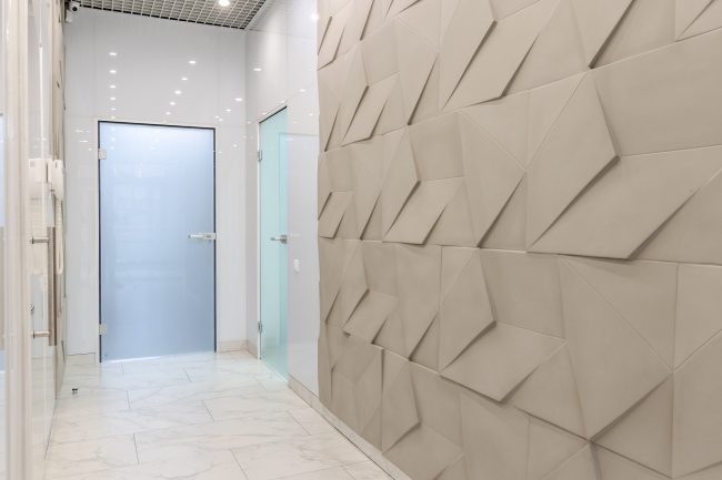
Wide corridors are devoid of unnecessary elements. However, they cannot be considered monotonous—an interesting solution is the use of decorative tile elements that create a relief wall resembling natural stone with regular facets.
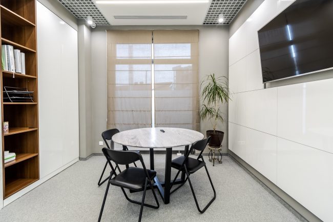
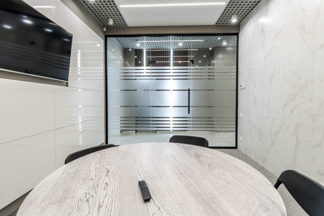
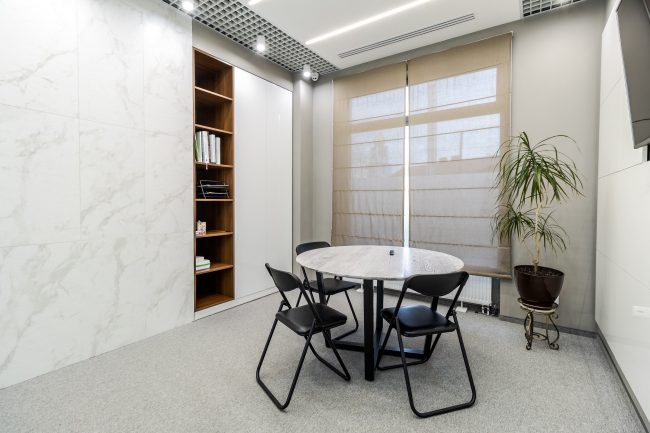
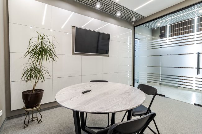
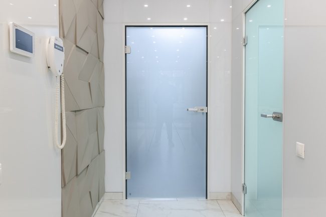
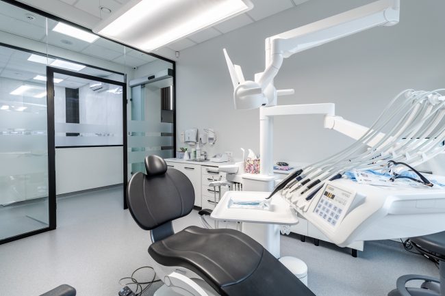
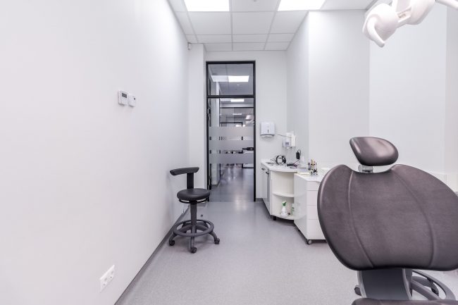
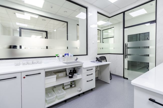
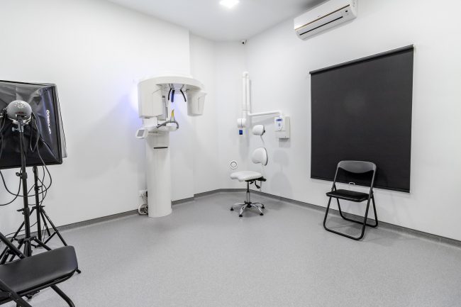
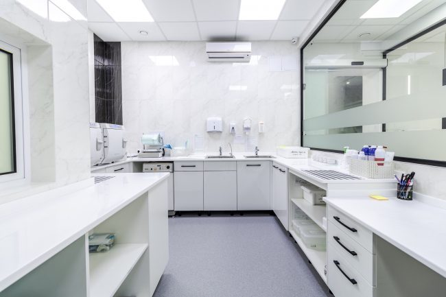
The interior of the offices emphasizes cleanliness and professionalism—white is the dominant color throughout. The only contrasting features are the vertical columns on either side of the windows, the black door handles of the cabinets, and the frames of the mirrors. The offices are separated by glass doors. A high glass partition delineates the conference room. The interior design of the SYMBIOTIKA DENTAL CENTER is an exceptionally minimalist and refined project that can serve as a benchmark in the development of such projects.
#Best_Interior #Interior_Design #Realisation
